The Psychology of Colour Combinations
May 19, 2025Emotional Impact of Colours: From Calm to Energetic
Individual colours carry distinct emotional meanings. Our Cover Styl blog post Colors and textures: how to choose the right combinations for your décor, mentioned that soft tones such as a light blue, pale green, or pink are relaxing; in contrast, bright colours such as red or orange are stimulating and energising. As a rule, warm tones, such as red, orange, and yellow, energise and excite, while cool ones, such as blue and green, soothe. The neutral colors, such as grey, white, and beige, offer a stable, serene backdrop. Of course, personal and cultural differences influence responses, but some universal trends hold:
- Blue is associated with calm, serenity, and trust. Blue often creates restful, trustworthy atmospheres (think of banks or healthcare brands).
- Red symbolises energy, passion, and urgency. It grabs attention and stimulates appetite, so red often appears in dining spaces and sale signage. A dash of red can make a design feel lively and bold.
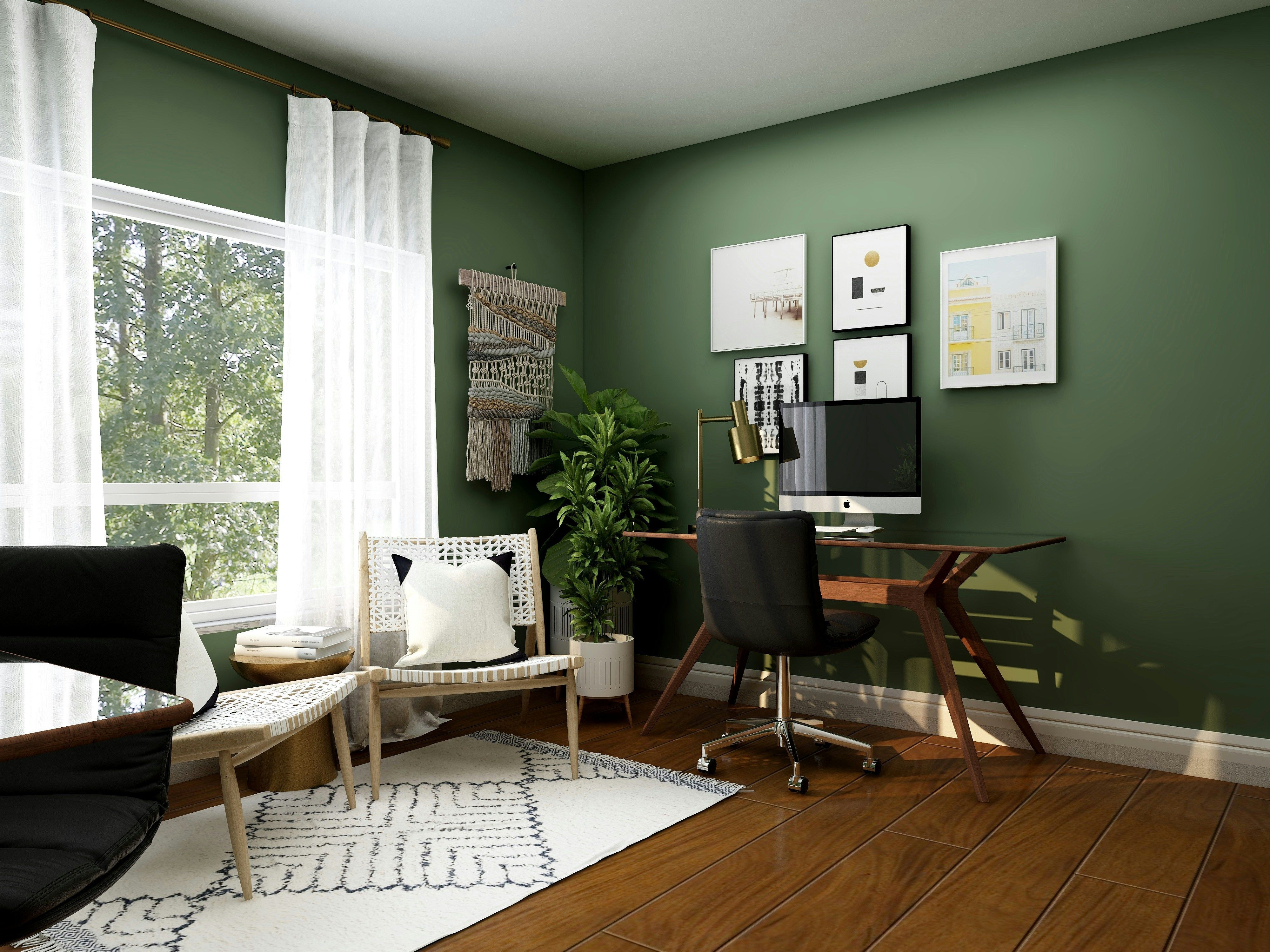
- Green evokes nature, balance, and renewal. It naturally cultivates a soothing, relaxing mood. Green interiors (like a sage-toned bedroom) reduce stress and promote tranquility.
- Yellow conveys optimism and warmth. Cheerful yellows brighten a space and encourage social interaction. To create an inviting, convivial mood, yellow is often recommended for kitchens or dining areas.
Pairing Colours to Shape Ambiance
Colour pairing meanings become even more powerful when you put hues together. Certain combinations can amplify feelings or balance them out:
- Complementary pairs (high contrast) Colours diametrically opposite on the colour wheel, such as blue and orange, red and green, or purple and yellow, have dynamic energy and visual interest. Designers frequently employ complementary schemes to make a space pop. These highly contrasting sets can be some of the best colour combinations for mood if your goal is liveliness and playfulness. For example, a room in blue and orange conveys dynamism since blue and orange are contradictory colors that add excitement but complement each other. In retail or product staging, strongly contrasting colours are attention grabbers that focus attention on focal points and merchandise displays.
- Analogous and tonal schemes (harmonious) Using the neighbouring colours, such as green-blue and orange-yellow, creates a balanced, restful feel—a consistent aesthetic suitable for calm settings. Likewise, a monochromatic scheme (variations of one colour) could bring soothing and sophisticated feelings. For instance, adding cushioned soft greens on top of beige and cream creates a serene interior with a natural touch.
Tips for Interiors, Retail, and Branding
- Serene home retreats: For a calming space like a bedroom, stick to cool or neutral palettes with gentle contrasts. Soft blues, greens, or lavenders with off-whites, light wood, or beige instantly create a restful feel. Keep bold accents minimal—the goal is a soothing backdrop that promotes relaxation.
- Energising creative spaces: Don’t shy away from bright hues in spaces where you want to spark activity or creativity; a kitchen, office, or retail display. Often, the best colour combinations for mood uplift include a lively warm colour balanced by a cool one. For instance, turquoise walls with pops of coral and yellow can energise a café or playroom without overwhelming. High-contrast signage (red on white, black on yellow) grabs attention in shops. Studies show warm colours like red and yellow excite and spur action, while cool colours like blue and green calm and encourage browsing.
- Trustworthy branding palettes: Brands also choose colours strategically. A finance or tech company might use blue or green to signal stability and reliability. Adding a complementary accent (like an orange “Buy” button or red trim) injects energy or urgency without undermining a trustworthy tone. Luxury brands often pair deep navy or black with gold for an elegant, exclusive feel. In any case, ensure your core palette aligns with the emotions you want customers to feel.
Finally, implementing bold colours doesn’t have to mean permanent change. Many designers and homeowners use temporary decor or adhesive solutions for interior designers to test colour pairings on walls or furniture before committing. This lets you preview the mood and easily swap out colours as trends or tastes evolve.
For further ideas and inspiration, visit our Cover Styl blog for creative decoration and colour use articles, and browse our case studies to see real-life transformations. By understanding colour psychology in action and seeing successful palettes, you’ll be equipped to design spaces that look beautiful and feel just right.