Burgundy in Interior Design: A Bold and Sophisticated Choice
July 8, 2025Why Burgundy in Interior Design Works
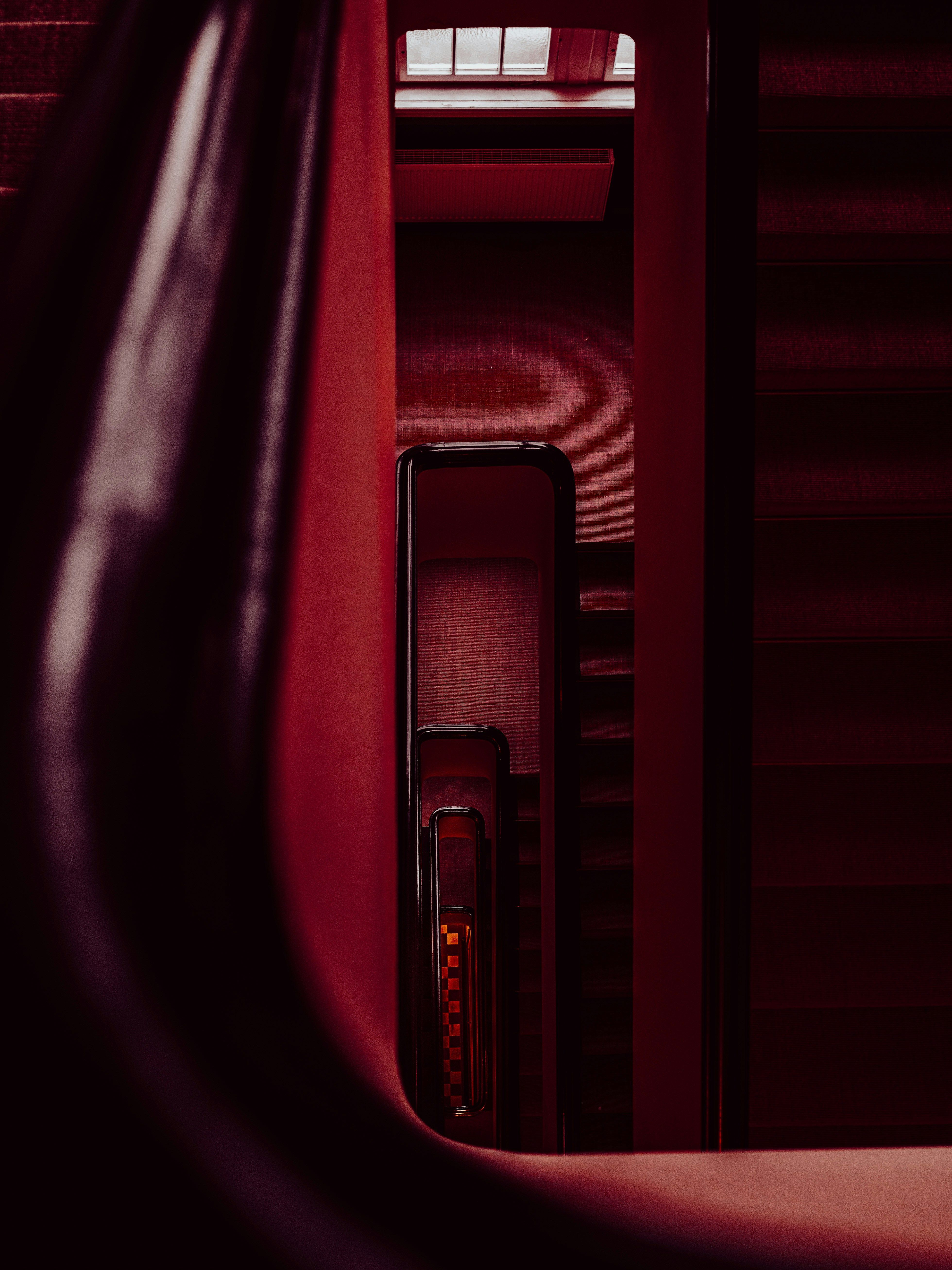
Burgundy doesn’t scream for attention; it simply shows up and owns the space. It’s the slow burn, the after-hours jazz, the quiet confidence in a world full of pop culture and shouty interior color trends. Where other colors compete for recognition, burgundy is confident in its position in the color hierarchy. Even a burgundy accent wall knows it is magic. As do design professionals, homeowners, and hospitality providers of sophisticated taste.
Burgundy in interior design puts in double duty: it grounds a space with richness and depth. There’s something inherently luxurious about the tone, like it knows it’s descended from royalty and fine wine. Deep red interior finishes create warmth, but also a sense of permanence and taste. Burgundy is not for those who redecorate every time Pantone announces their color of the year.
There is a reason burgundy in interior design keeps popping up across interior design magazines and architecture showcases. It plays well with natural light and adds instant atmosphere. Whether you’re working with bold modern lines or classic vintage pieces, it gives you that ever-elusive “put-together” look. While burgundy may not be trend-proof, it is trend-resistant. And in a sea of disposable décor ideas that change by the whim of the magazine editor du jour, that’s no small thing.
Right Materials and Finishes to Pair with Burgundy
Like its viticultural namesake, burgundy loves to socialise. It plays well with others, but only if they are worthy of its presence. Pair wine with the wrong meal and it becomes overbearing and unappetising. Pair the color with the wrong finish, and it turns muddy or melodramatic. But if you get it right, you’re looking at high-end harmony.
Start with texture. Burgundy in interior design loves the tactile: velvet, matte wraps, brushed metal, even raw wood. Deep red interior finishes come alive next to warm-toned metals like brass or antique gold, and find a modern edge alongside blackened steel or soft satin chrome. In domestic kitchens or public retail spaces, burgundy cabinetry or surface wraps can break the designer’s paradox by feeling both luxurious and grounded.
Classic deep timber tones like walnut, mahogany, and oak draw out burgundy’s timeless warmth, while the modern color palette for interiors like bone, taupe, or soft greys allows a more contemporary feel. Want moodier drama? Pair it with navy or charcoal. Forest green and burgundy are a classic combination. This isn’t just color theory or chasing interior color trends, but how to use burgundy in décor to build a space that feels intentional, welcoming, and sophisticated.
The trick is contrast and complement, not camouflage. Burgundy wants to be seen. As a standalone, it’s an understated elegance. With the right supporting cast, it steals the scene without saying a word.
Burgundy in Interior Color Trends: Timeless or Trending?
Is burgundy having a moment, or has it never really gone away?
Yes. To both. Burgundy is having a well-deserved resurgence in the modern color palette for interiors right now. Interior color trends are moving away from the boring neutrals and garish primaries in favour of moodier tones. Drawing inspiration from dark academia, eccentric whimsigothic, and rich minimalism reminiscent of British pubs and Asian temples, deep red interior finishes are popping up in lookbooks and are everywhere in ‘how to use burgundy in décor moodboards’. Again.
But let’s not pretend it ever really left. Burgundy isn’t a seasonal fling. Burgundy is a designer’s fallback when the brief says elegant, but not sterile. It doesn’t date as fast as teal or millennial pink, it’s not as oppressive as the dark charcoals, and it carries more weight than beige ever will. That’s why burgundy in interior design remains a go-to: it adapts, elevates, and survives interior color trend fatigue.
Whether used as a burgundy accent wall or wrapped across cabinetry in matte finish, it reads as intentional, not impulsive. In a world obsessed with what’s next, burgundy is quietly, confidently still here.
How to Use Burgundy in Décor
Burgundy can be surprisingly subtle for such a bold color choice. With a bit of imagination, one can utilise burgundy in interior design into a space without needing a complete wine-colored makeover.
Start small. A burgundy accent wall in a hallway or reading nook creates impact without being cloying or cliché. Bringing in deep red interior finishes on furniture, cabinetry, or wrapped surfaces can create subtle cohesion across a space. Placement is key. Burgundy works best when it’s intentional, not everywhere.
For renters, renovators, or the commitment-phobic, self-adhesive solutions are your best friend. A product like a burgundy adhesive film for wall panels gives you the look without the labour, no paint fumes, no drama, just peel-and-press luxury. And if you’re unsure how it’ll feel in your space, test with a small panel or swatch. Don’t chase Pinterest perfection or the whimsy of interior color trends, let it sit with you. You may find it stays with you.
Sophistication That Stays
We all know interior color trends come and go, and while burgundy often falls out of fashion, it never loses the high ground. From bold statements or quiet accents, burgundy in interior design brings confidence that can’t be faked. It’s the choice that says you’re confident in your choices and not here to outsource your opinions to Instagram.
Burgundy’s a color that elevates, holds space, and is sophisticated without feeling you need to be wearing a hat and gloves. Even a burgundy accent wall has presence. And it plays beautifully with materials, styles, and moods across the board.
If you’re ready to move beyond the beige and into something with backbone, burgundy’s waiting.